Truffle Mad Gin
Mad indulgence
from the ground up
Truffle Mad Gin is a premium small-batch gin from Australia’s Southern Highlands, infused with fresh black truffles grown on the client’s family farm. Created under the Redwood Distillery name, the product introduced a distinctive “paddock to pour” proposition: a gin rooted in provenance, rarity and the wonderfully obsessive world of truffle farming.
Client Redwood Distillery
Services Brand Identity, Label Design, Packaging Design, Art Direction,
Production Management, Supplier Liaison
Credits
Glass Supplier • Saverglass
Printer / Label Production • MCC
The Challenge
The challenge was to create a brand and packaging design for an unusual premium spirit, balancing the earthy mystery of black truffle with the more established cues of the gin category.
Working directly with the client, the project needed to move from early concept to finished product within six weeks, in time for a local launch. This meant fast creative development, clear decision-making, supplier sourcing, artwork testing and careful production management across both glassware and print.
The Approach
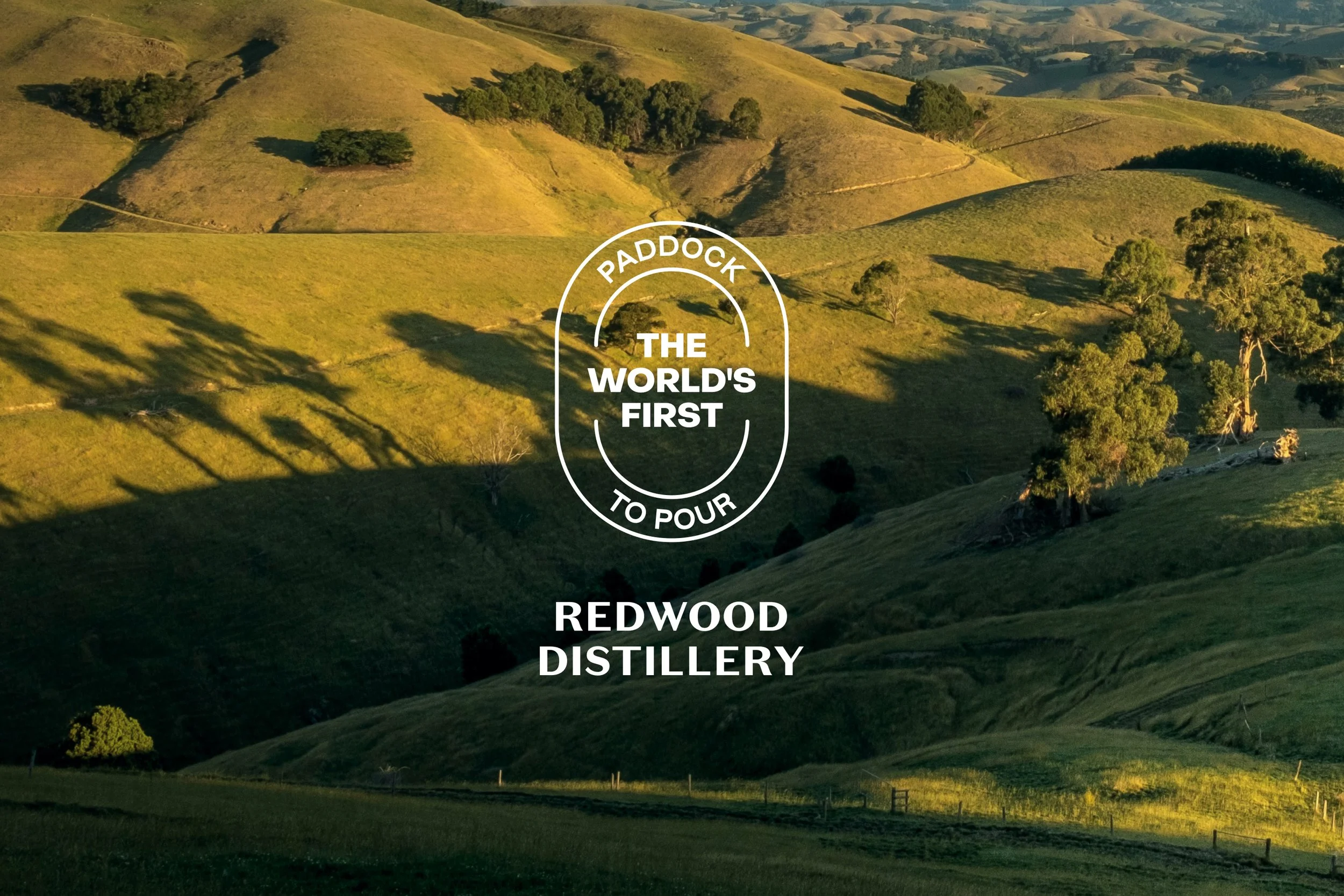
The creative direction was rooted in the client’s story: a family farm, the rare and unpredictable nature of black truffles, and the slightly mad ambition of turning them into gin.
I explored several levels of brand expression, from more restrained premium spirits cues through to bolder, more expressive routes that pushed the product’s unusual ingredient story further. This allowed the client to understand how far the identity could stretch creatively before landing
on a direction that felt tactile, premium and quietly distinctive.
The chosen route used a textured graphic language inspired by truffle veining, which could also be read as a topographic reference to the Southern Highlands landscape. This connected the packaging back to both ingredient and place, giving the brand a stronger sense of provenance.
With the production timeline already tight, I used my own research and production knowledge to recommend glassware and print suppliers who could deliver on time and within budget, while still supporting the quality of the final product.
Brand Expression
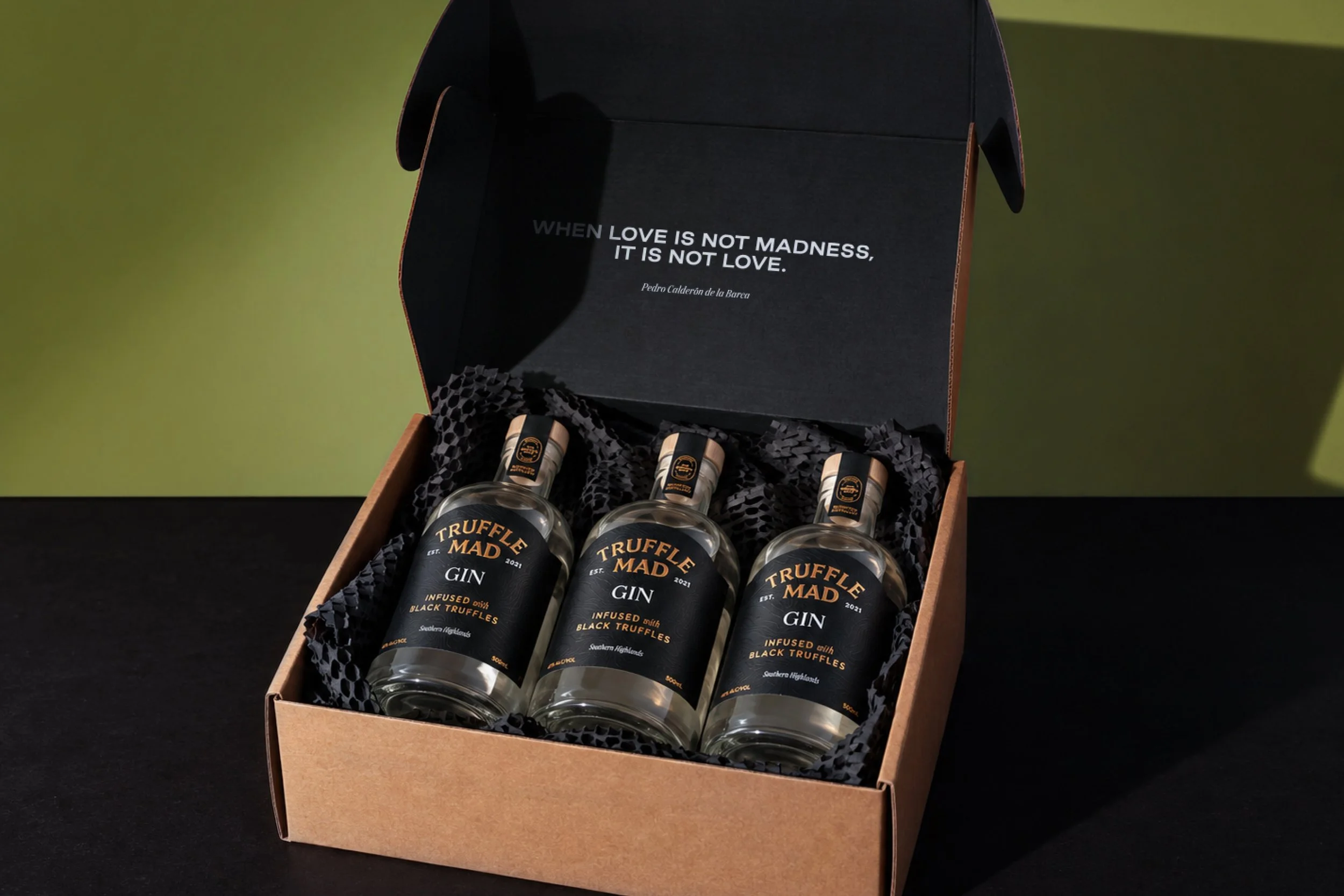
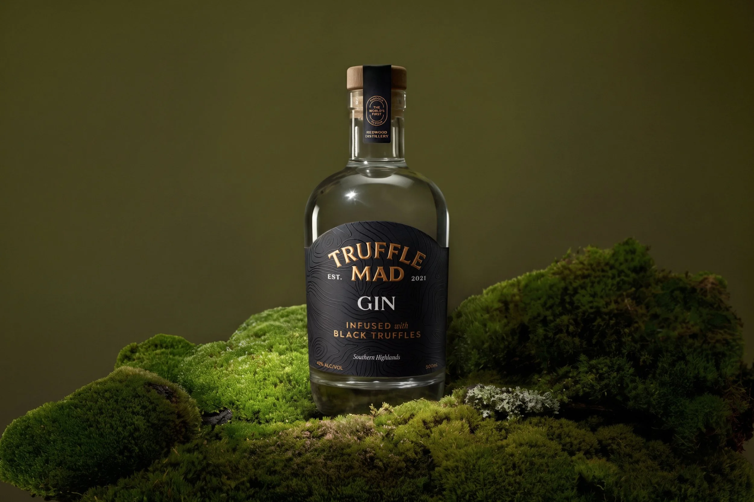
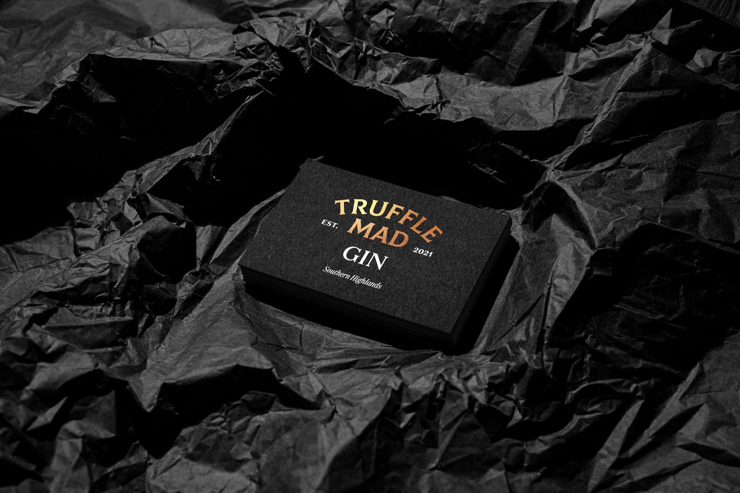
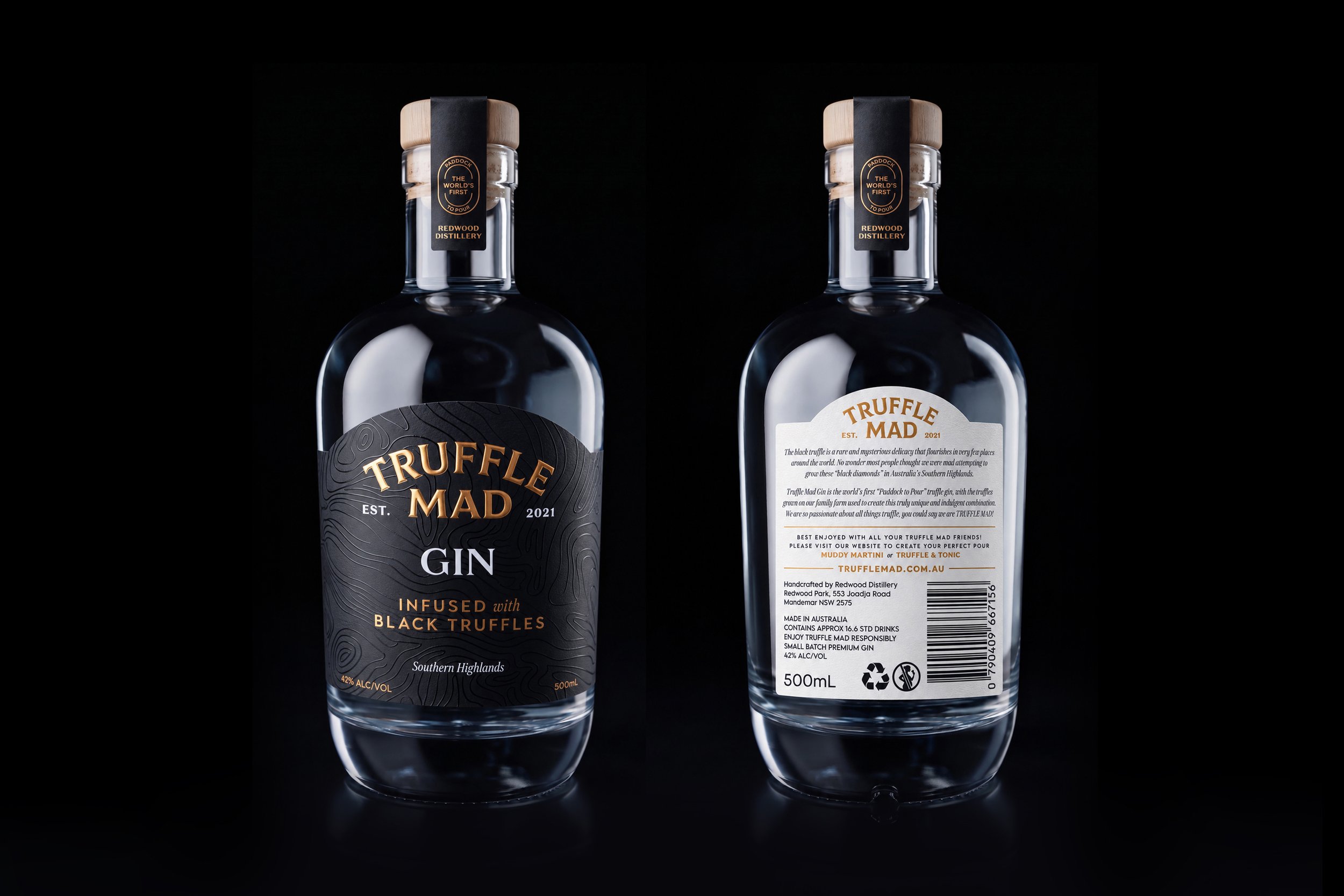
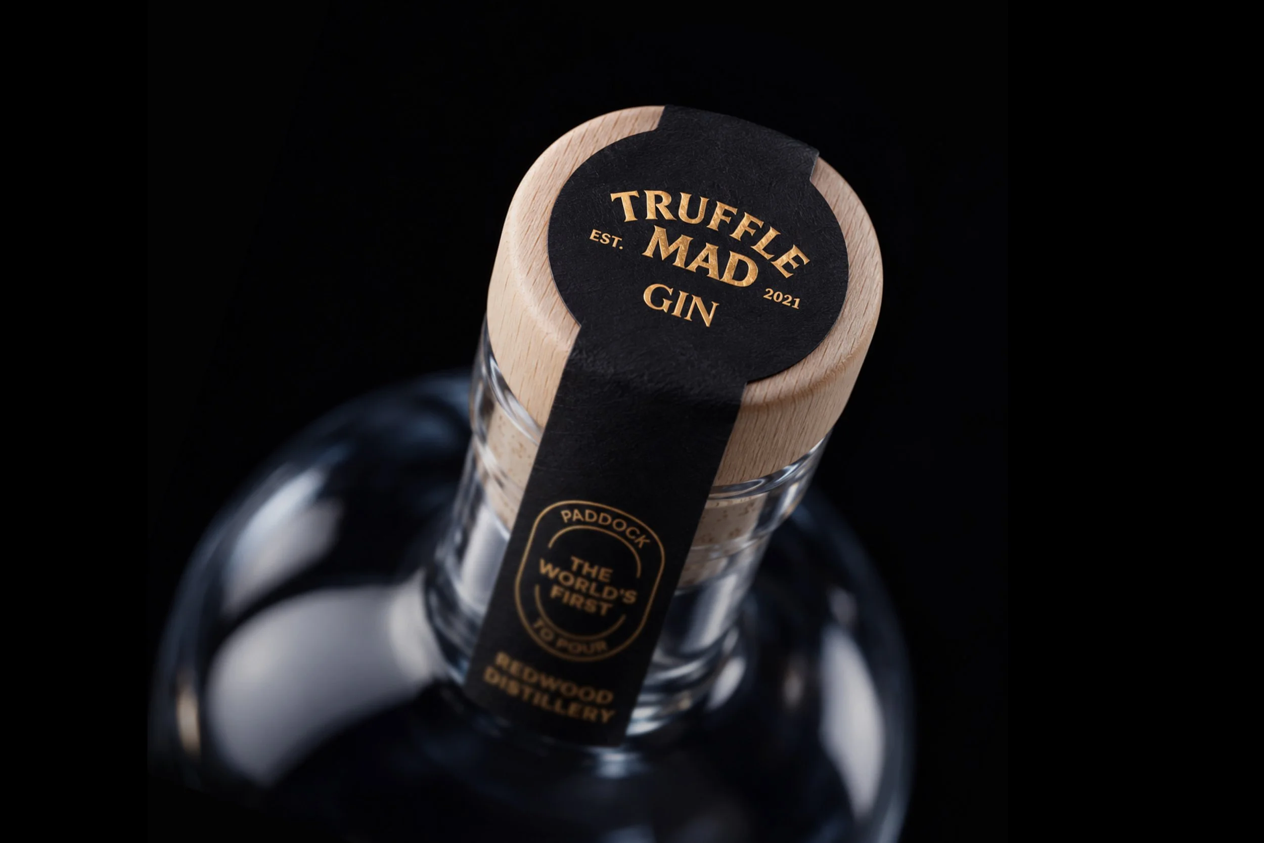
The final identity combines traditional spirits cues with a tactile, ingredient-led story. An apothecary-style bottle gives the product a sense of craft and provenance, while the black label, warm metallic detailing and high-build gloss texture create a richer, more premium feel.
The visual language draws from the idea of truffle as something rare, hidden and of the earth: a mysterious black diamond, uncovered from the ground. This sense of discovery informed the dark, textured label treatment, where the raised pattern adds depth and texture without overpowering the design, inviting people to pick it up, turn it in the light and discover more.
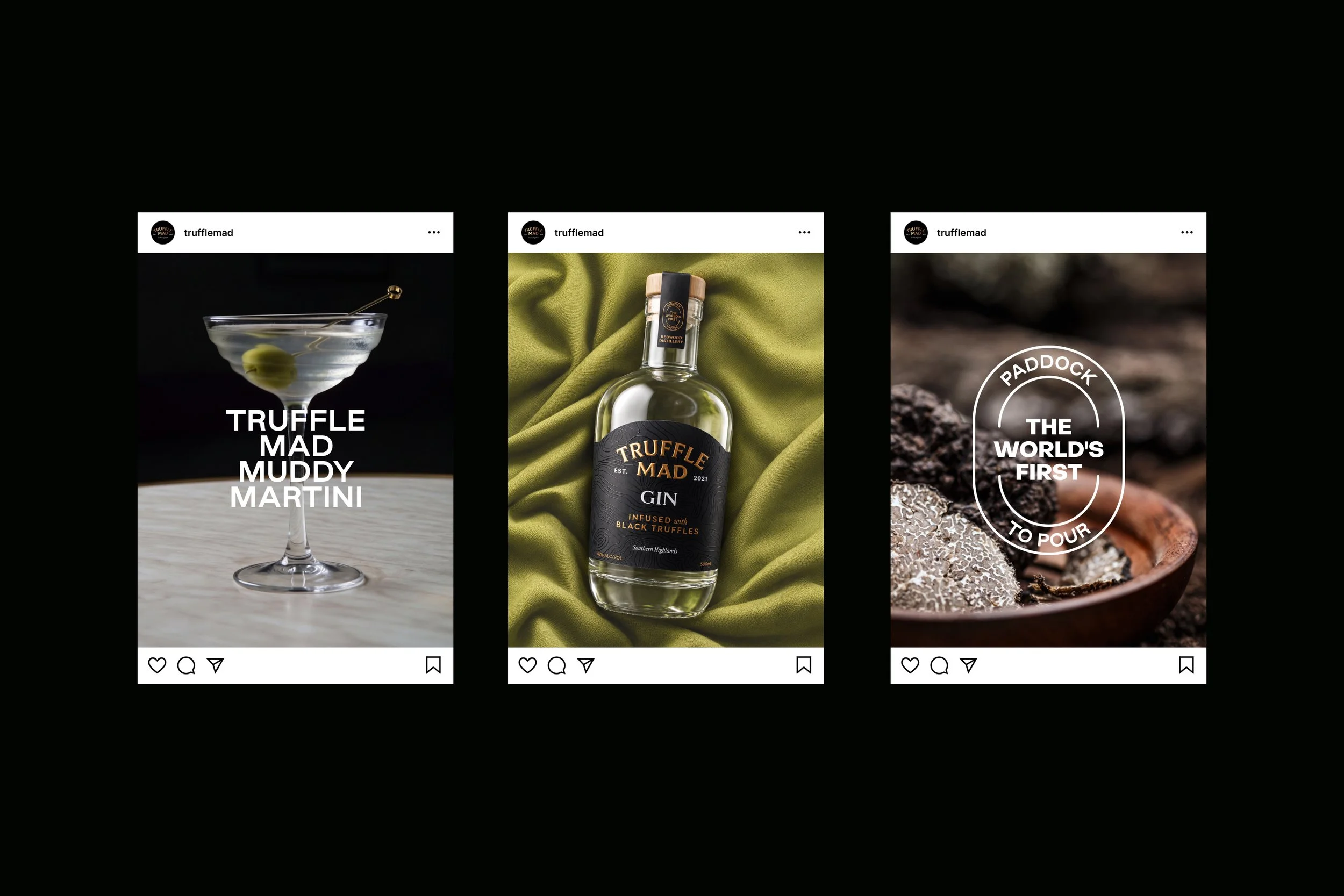
The label system is deliberately restrained, allowing the typography, bottle shape and material finish to carry the brand. Art direction extends this sense of quiet discovery through dark, earthy photography, close-up ingredient details and atmospheric styling, connecting the product back to truffle, landscape and origin.
The Result
The final packaging delivered a distinctive, production-ready identity for a highly unusual small-batch spirit, balancing storytelling, shelf presence, material detail and commercial appeal.
The gin launched locally through farm, market and regional hospitality channels, giving the client a premium brand expression to introduce the product and support future truffle-based ranges. It has since gained recognition within the spirits category, including Silver awards at the 2023 London Spirits Competition and the 2023 Australian Distilled Spirits Awards, and has been stocked by major Australian retailers including Dan Murphy’s and BWS.