Movement Collective Pilates
Pilates for every body
Movement Collective Pilates is a Sydney-based studio focused on inclusive, reformative movement and personalised practice. After years operating under a licensed training institute identity, the studio sought to establish an independent brand that better reflected its philosophy, personality and community — while giving the team a more flexible platform for future growth.
Client Movement Collective Pilates
Services Brand Strategy, Visual & Verbal Identity, Brand Refresh,
Website Design, Art Direction & Production Management
The Challenge
The existing brand lacked contrast, distinction and flexibility, making it difficult for the team to create consistent, accessible communications across in-house marketing and social media.
The new identity needed to stand apart in an increasingly crowded Pilates and wellness category while communicating what makes Movement Collective different: highly personalised teaching, small-group attention, deep expertise and a genuine sense of community. Just as importantly, the system needed to be practical enough for the team to manage confidently day to day.
The Approach
The rebrand centred on inclusivity and movement as a visual language. Geometric forms derived from Pilates poses informed the logo structure and supporting graphic elements, subtly referencing the body in motion while avoiding conventional fitness imagery.
The verbal identity was developed around the same philosophy. Confident, conversational and occasionally witty, the tone balances expertise with warmth — making complex ideas feel approachable while reinforcing the studio’s belief that Pilates should adapt to the individual, not the other way around.
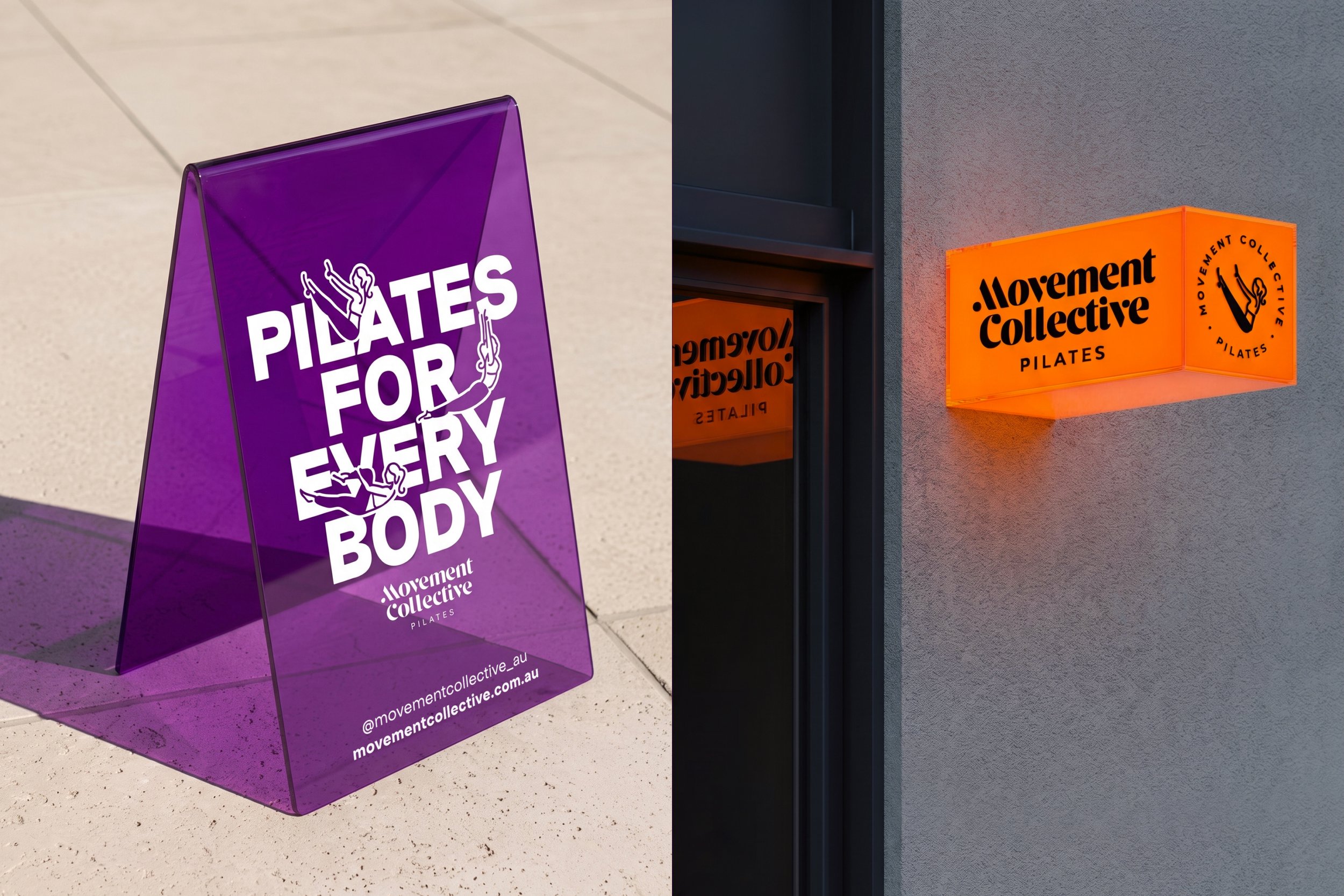
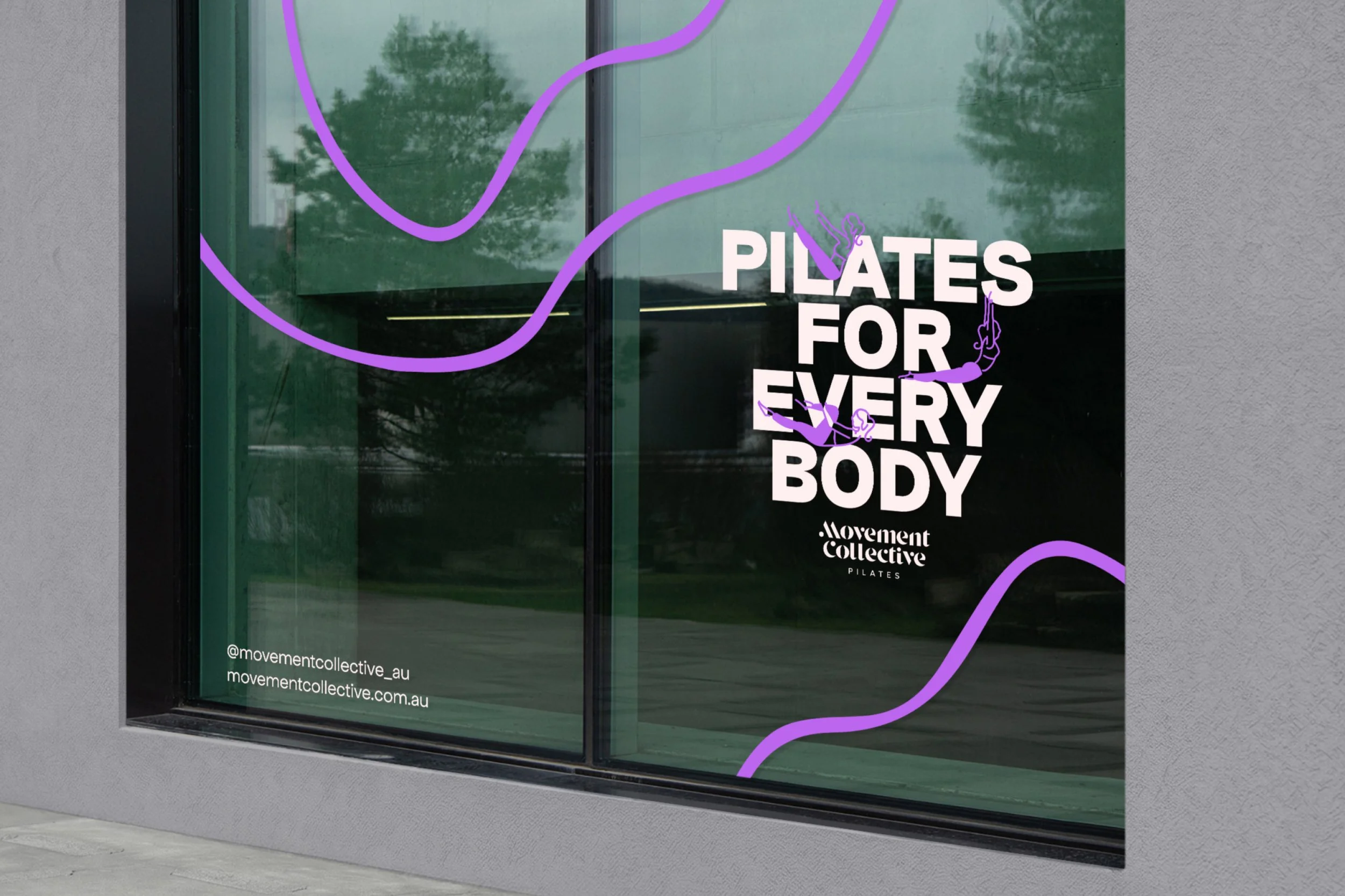
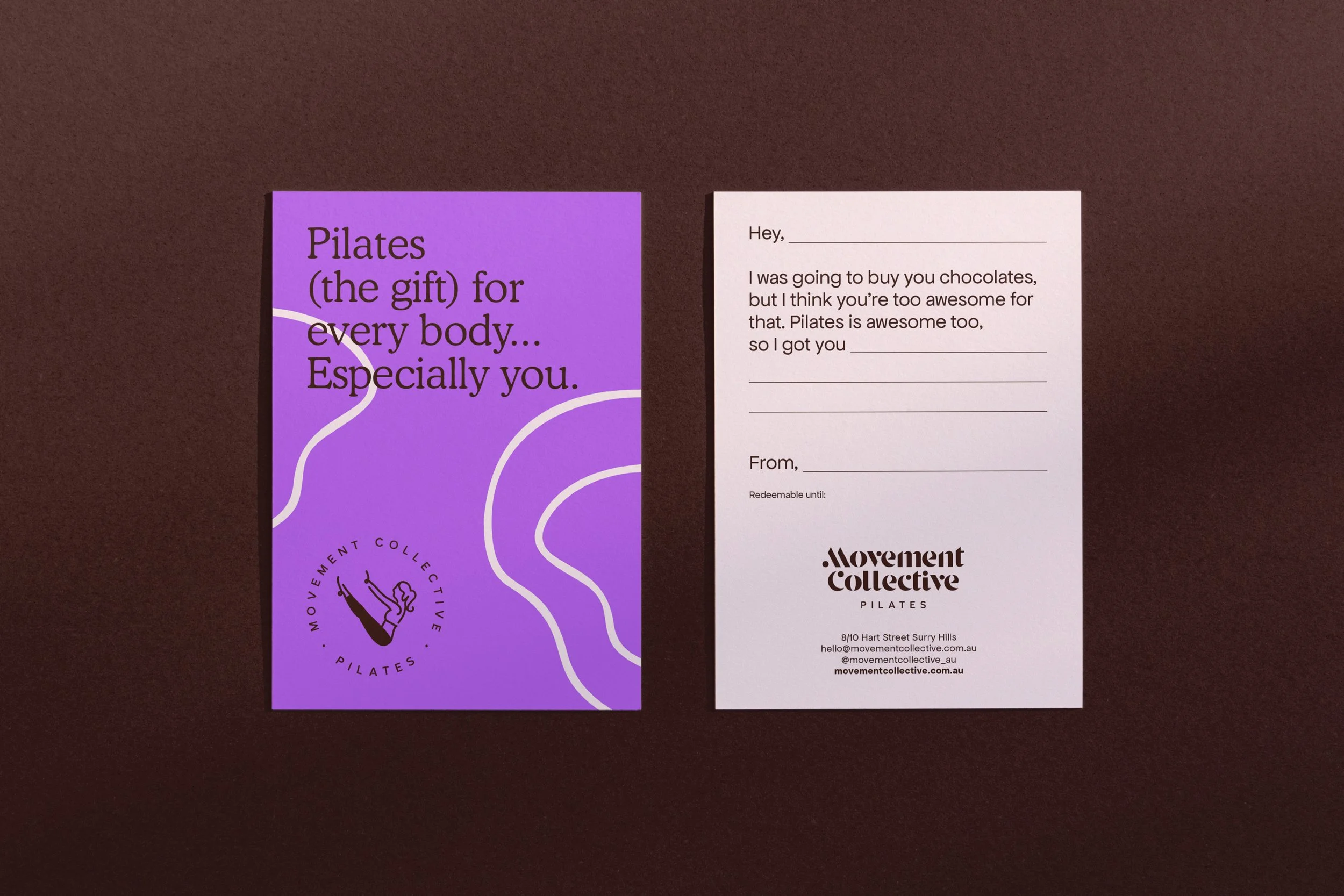
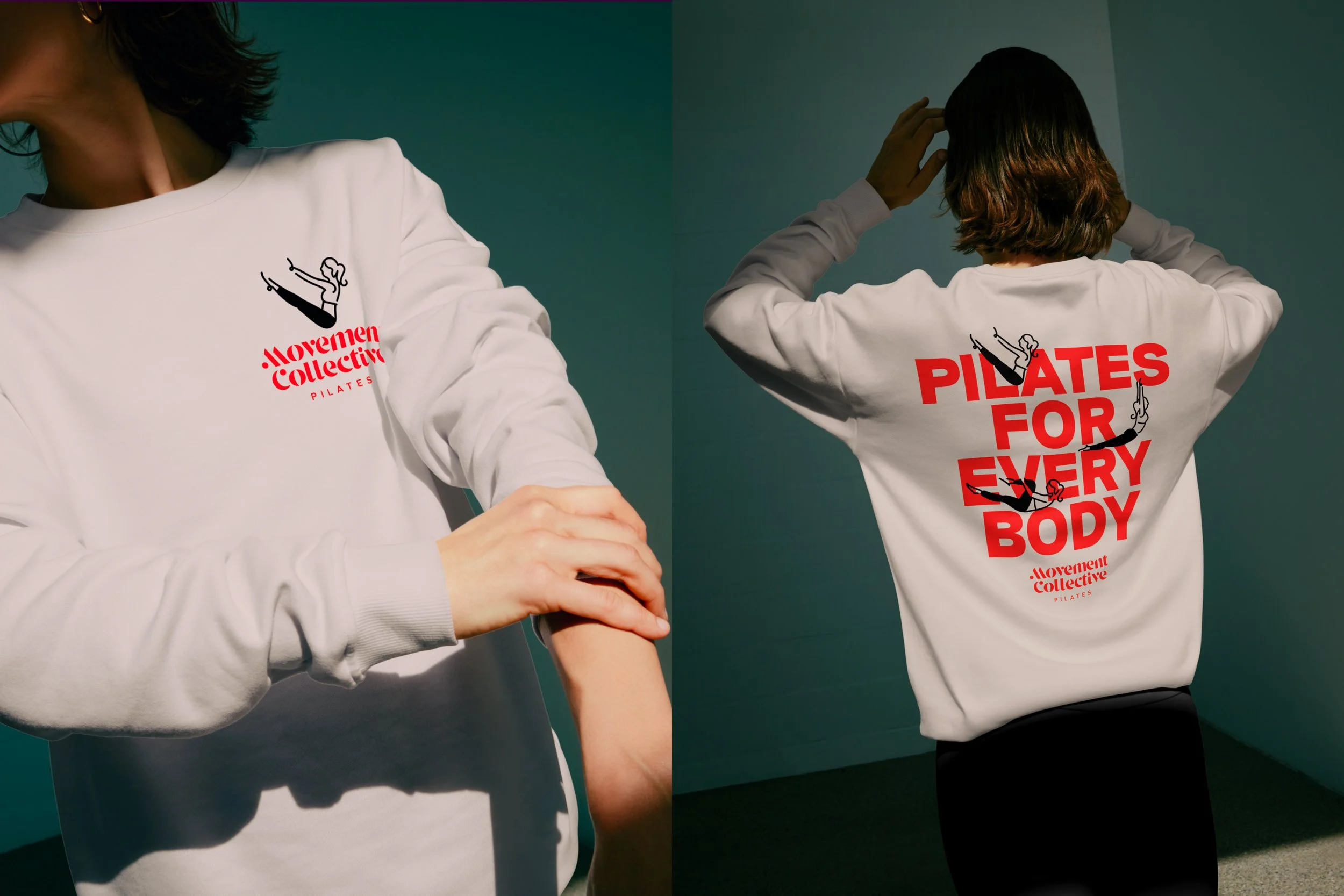
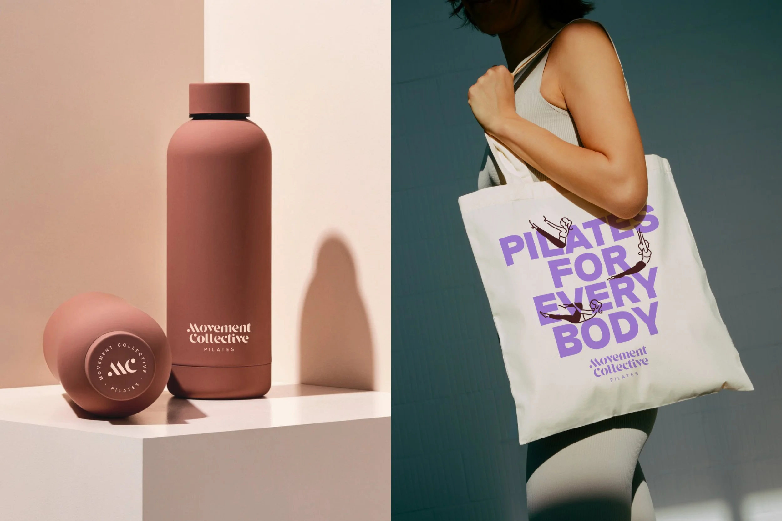
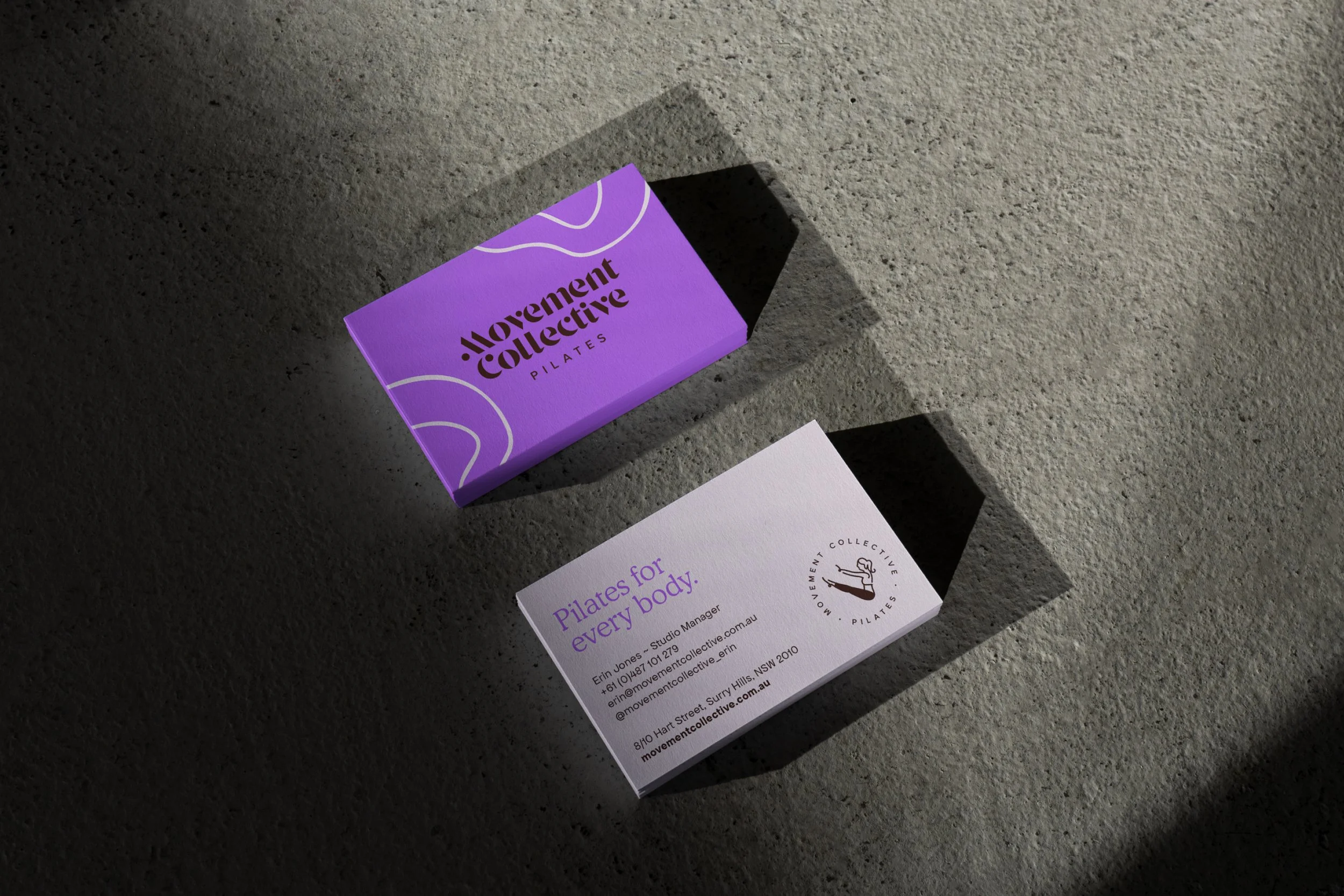
Beyond the core identity, the project extended across website design, social media templates, signage, printed collateral, merchandise and art direction for studio photography.
As a self-managed freelance project, I led client communication, strategy development, creative direction and production management throughout, ensuring consistency between the brand story and its execution across every touchpoint.
Brand Expression
The visual system balances movement, individuality and confidence. Expressive typography introduces personality, while illustrated Pilates figures and free-flowing linework create a recurring visual language inspired by bodies in motion.
A high-contrast palette of saturated purple and orange, grounded by chocolate brown and soft blush, gives the brand greater visibility and a contemporary lifestyle sensibility. Photography brings warmth and humanity to the system, shifting the visual language away from polished fitness clichés towards something more personal, intelligent and lived-in.
Messaging reinforces this individuality throughout the brand. Phrases such as “Pilates isn’t one-size-fits-all. Neither are we.” and communicate the studio’s point of difference with clarity and wit, while longer-form copy reflects the founders’ curiosity, expertise and belief in teaching the person in front of them.
Together, these elements form a flexible identity that can move confidently between studio signage, social content, digital communications, education, events and merchandise without losing its distinctive character.
The Result
The refreshed identity positioned Movement Collective as a confident, contemporary and inclusive studio with
a clearer point of difference in the Pilates market.
The clarity and flexibility of the new system empowered the team to manage their marketing internally with greater consistency, while the strength of the brand supported the expansion of Movement Collective’s teacher training and continuing education offer.
The studio has also received positive feedback from clients who feel the brand genuinely speaks to them
— translating the personalised, thoughtful experience of attending Movement Collective into its outward communications. The result is a brand that not only looks more distinctive, but more accurately reflects
the people, philosophy and community behind it.